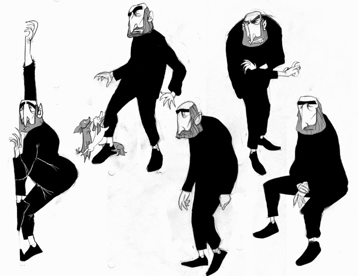
Peachboy designs done at The Animation Collaborative
A while back I spent 6 months in a character design class at The Animation Collaborative. The instructors were all designers at Pixar, which is across the street. I expected them to teach the technical aspects of design, but it was nothing like that. Instead they taught us how to design something new and appealing. As one of the instructors, Chris Sasaki put it, "All there is to teach about design is shape, silhouette and proportion. Great, so that took one class. Now what am I going to teach for the other 11 classes? How to design something unique." The whole experience was fantastic. Not only did it change how I looked at design but the skill and passion of the other students inspired me in a way I haven't felt since college.
The biggest surprise was how little the instructors cared about drawing ability. They had the attitude that a good drawing was just a matter of practice. Anyone can do that. Creating something new and appealing, that was true skill. A great drawing could still be a terrible design. They're not the same thing. The opposite can also be true. Take the Paranorman designs for example. They're not the best drawings in a traditional sense but they're masterful designs.
The lesson that stood out most was about "symbols". The concept is this: If you draw a tree, you'll likely draw a circle above a square trunk and maybe an apple off to one side, or a jaggy triangle with a square bottom. They don't look much like real trees, but they're symbols of trees that popular culture has shoved into our subconscious. Now imagine what you would draw if you actually looked at a tree and tried to make an abstraction of what you're seeing. You might draw something brand new. All of design works this way. A new and unique design style gets popular, say Bugs Bunny or Tim Burton or Anime. and it works its way into our subconscious. The styles and designs become symbols just like the trees and we can unintentionally draw those "symbols" instead of making something truly new. (for examples of people drawing symbols see: literally all of deviantart.com) Disney made a fantastic video about this. If you haven't seen it already, check it out.
My favorite assignment was one where we were given 3 written descriptions of literary characters with their names removed. We had to do designs based on the descriptions in a medium we were unfamiliar with. I did mine with stamp blocks. Afterward we were told the characters were Ichabod Crane, Dracula and Huck Finn. Had we known beforehand, we would have designed them with their iconic designs influencing us. Instead, our limited knowledge combined with the new medium gave everyone radically new and interesting takes on the characters. Afterwards we chose one of the designs and further fleshed it out. It was a fantastic example of the power of symbols, made even more potent when I did my first pass at developing Dracula's design. It was pointed out that, now that I knew who he was, I was starting to change the design to be more like the "symbol" of Dracula and in the process losing everything that was unique about the original concept art.
Ichabod Crane, Dracula and Huck Finn
Nope! Generic! Do it again!!!

back to the original design
!!!FIND OUT IF YOUR DESIGN IS GOOD WITH THIS ONE WEIRD TRICK!!!
One thing they stressed in the class is that a good design informs you about the character. Thus, you can objectively test the quality of your designs by showing them to someone and asking them to describe the character. The more they describe about the character, their personality, habits, home life, ect, the more successful it is. If they say something like,"It's a guy. He has really big muscles", it's time to go back to the drawing board.
A few more designs from the class.
Using shape to describe personality
Reference and initial thumbnails of a final design
A design based on the randomly selected nouns "Mary Poppins, Cop, Toy"
So, in summary, great class, 10 out of 10, would take again.


No comments:
Post a Comment